
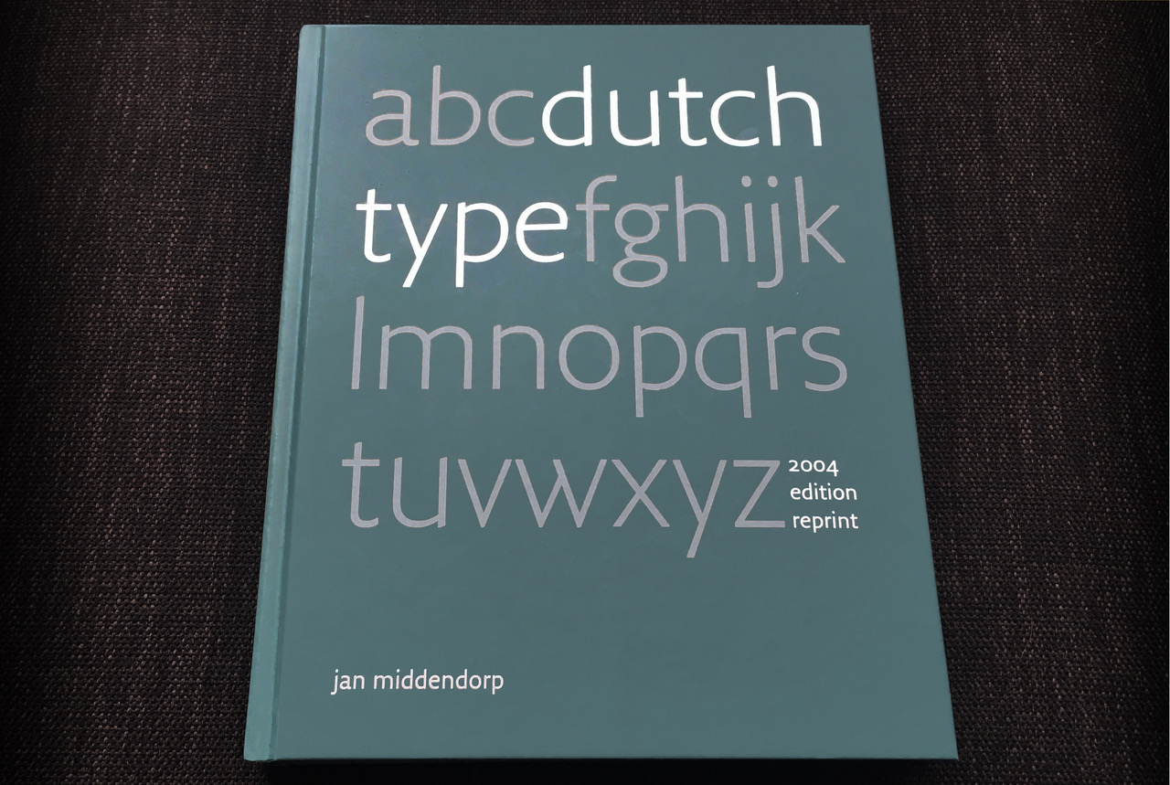
dutch type
Dutch Type is now more affordable!
The Dutch Type reprint was funded in 2018 through an amazingly successful Kickstarter crowdfunding campaign. Our thanks, once more, to all who supported us! In the course of this unique year, sales have stalled. So we decided to lower the price drastically to make the book more accessible to students, budding designers and young letterform lovers.
Bookshops and webshops
Curious? Interested? Take a look at the new sales page! Organisations and schools will also find an interesting proposal for group orders.
About the reprint
Dutch Type was published in March 2004 and was received with huge enthusiasm. Its 3,500 copies sold out in 3 years. The book soon became hard to find and ended up being offered at embarrassingly high prices on Amazon, eBay and by antiquarians — between €400 and $800 for a copy.
In 2018 author Jan Middendorp decided to self-publish a near-identical reprint, and successfully financed the production with crowdfunding. Druk Editions is Jan’s own imprint, which published its first book in 2000.
Read an interview about the reprint and Jan’s background & motives in the Typeroom (by Parachute, Athens).
The book in a nutshell
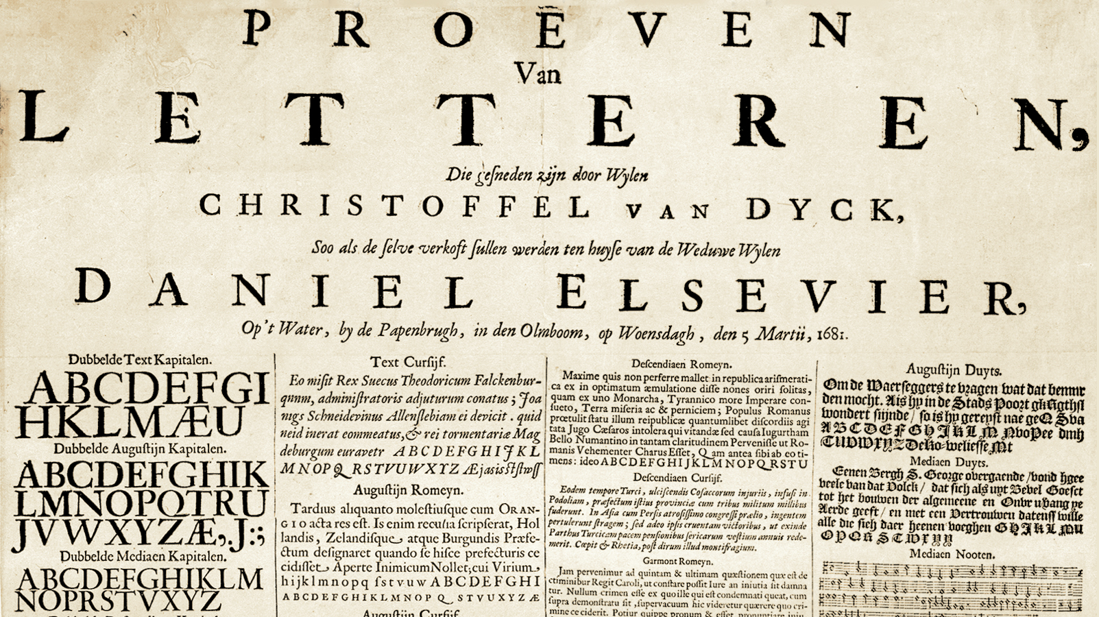
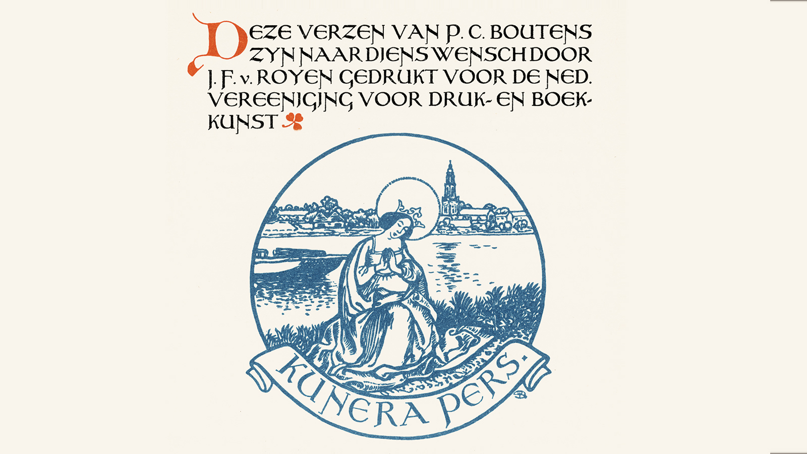
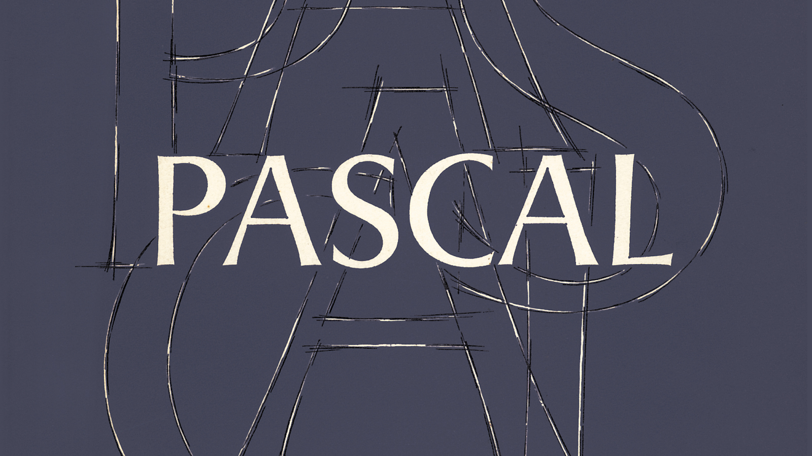
In Dutch Type, Jan Middendorp presents a comprehensive overview of type design and lettering in the Netherlands, tracing its origins through type designers and lettering artists from the 15th to the 20th centuries. Partly based on interviews, the book also offers insight into the motives and methods of the first generations of digital type designers, featuring published and unpublished typefaces as well as sketches, studies, and samples of lettering work. While the quest for quality and innovation has remained constant, it makes clear that the advent of desktop type has opened up the discipline to a more spontaneous, inventive, and democratic approach.
Why reprint the original?
Dutch Type is enjoyed for its attractive combination of historic research, storytelling, type analysis and wealth of images. Some information is well-known to specialists, but quite a bit was new when the book came out. The book has ardent fans, many of whom could not afford to buy one of the expensive second-hand copies of the original. Updating Dutch Type would have implied replacing more than half of it — which would have been self-destructive. Therefore we made available the original book, at the original price!
Where to buy?
The Dutch Type revival was supported by around 700 backers, who received their copies via the global (but Netherlands-based) fulfilment agency we hired. However, the campaign’s success allowed Druk Editions to print a serious run, and introduce the book in the international distribution networks. In order to make the book more accessible and cater to a larger market, we have reduced the price — less the half the original price from 2004 and 2018.
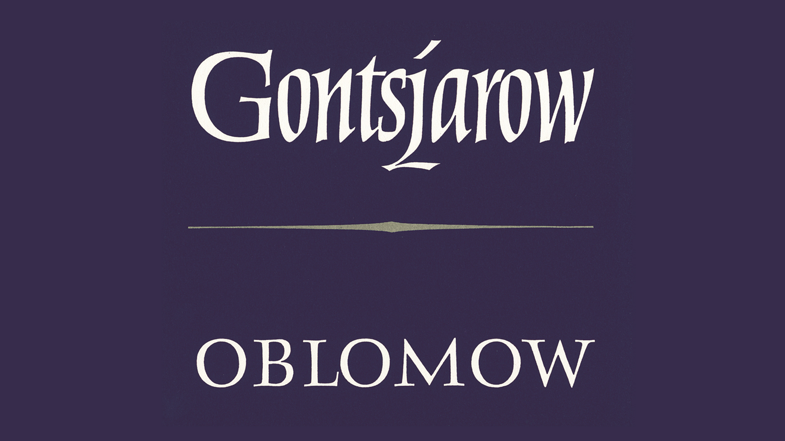
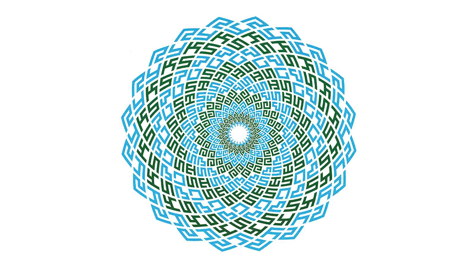
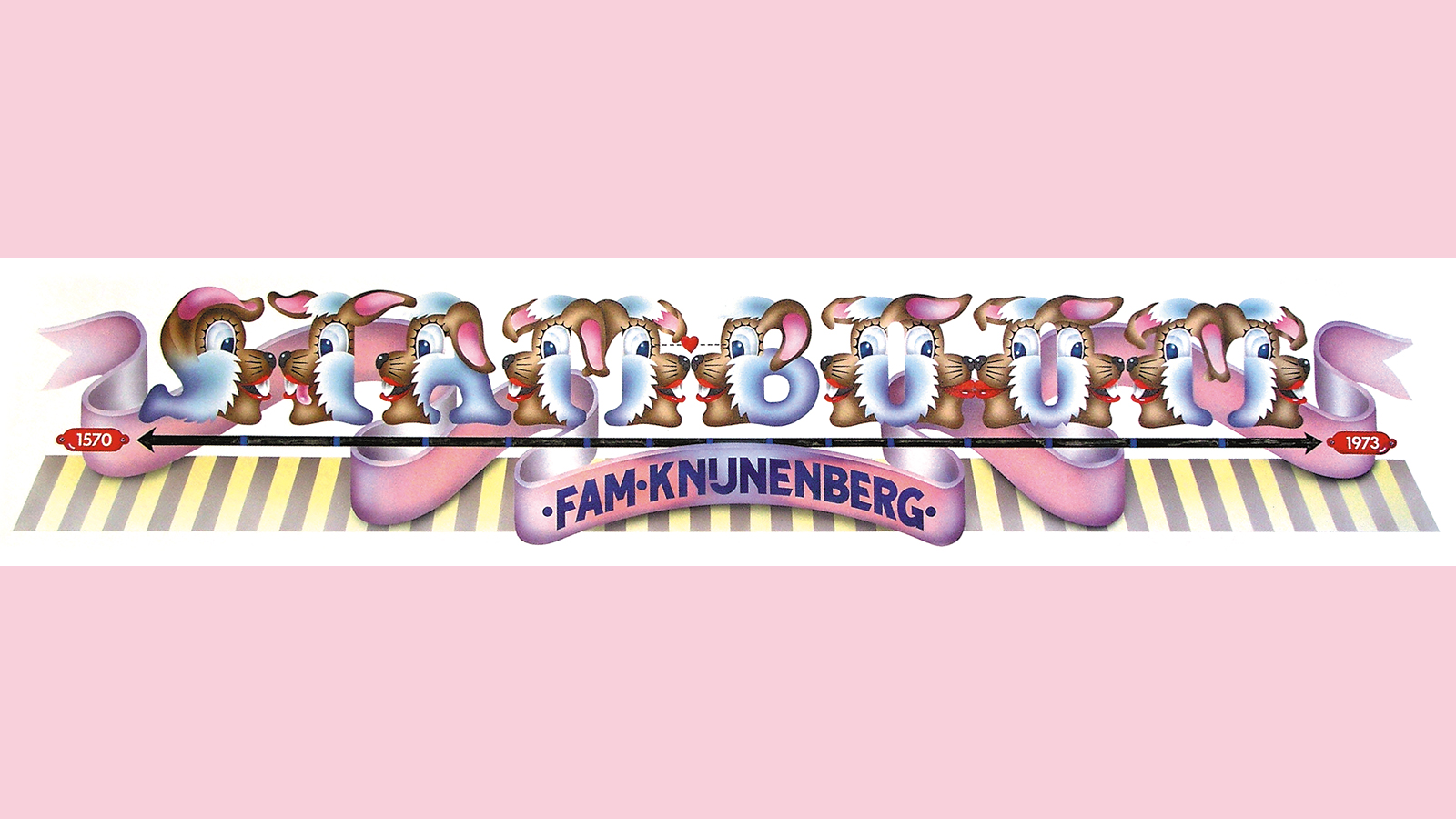
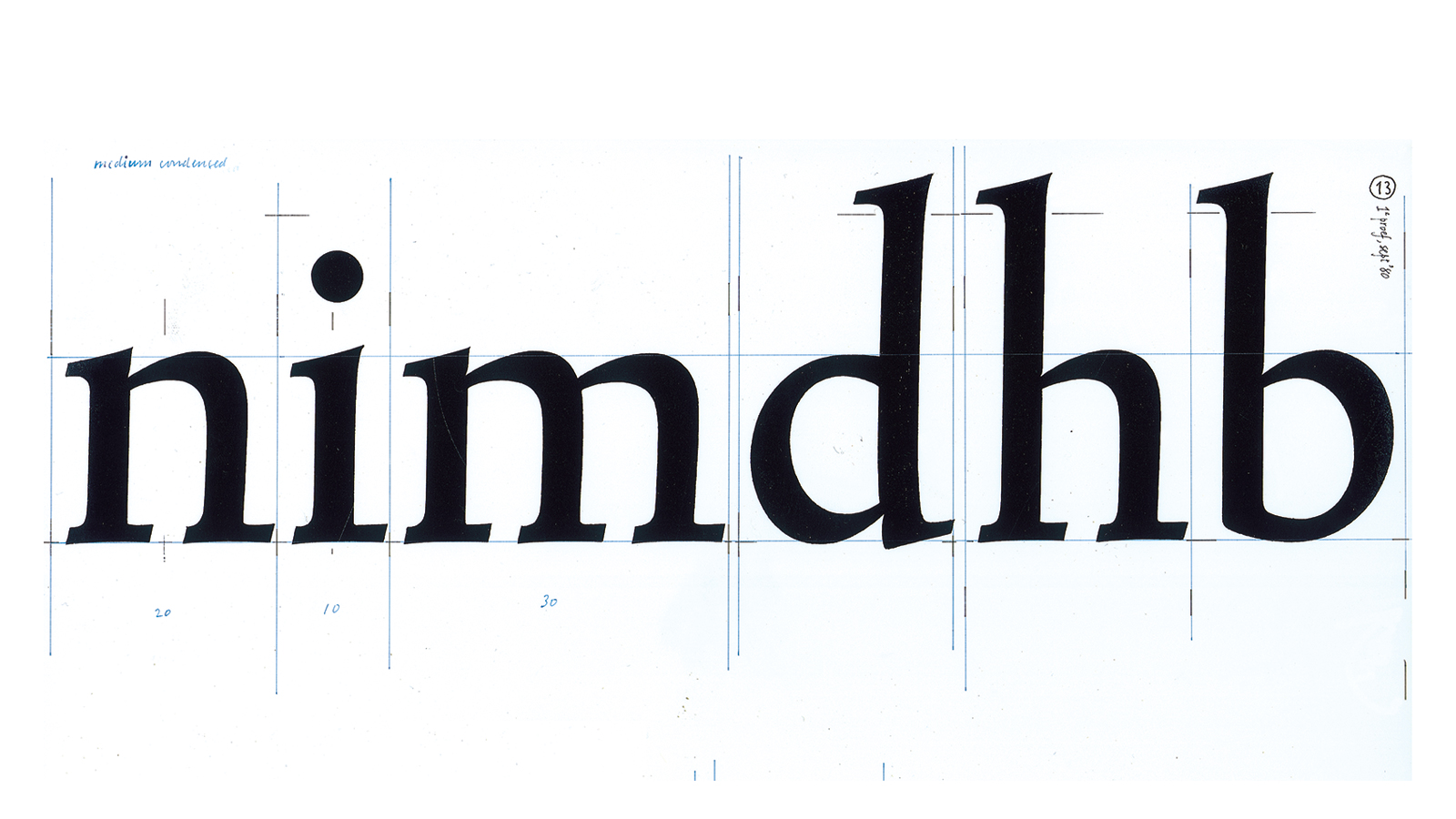
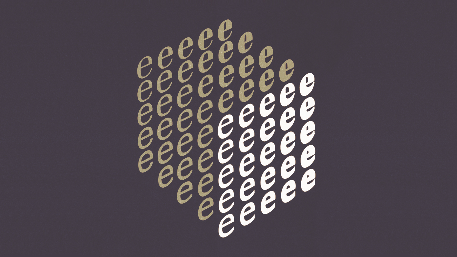
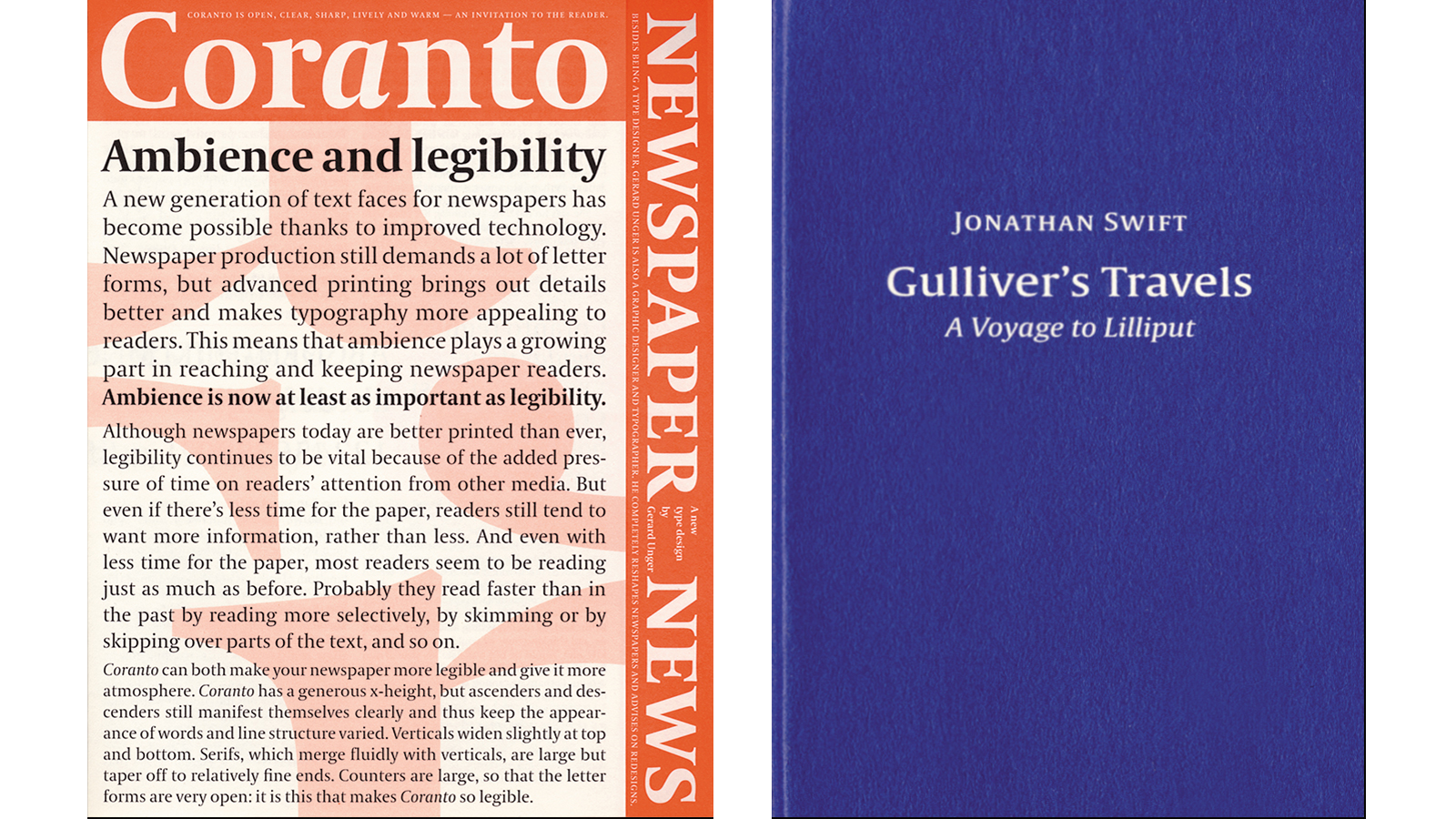
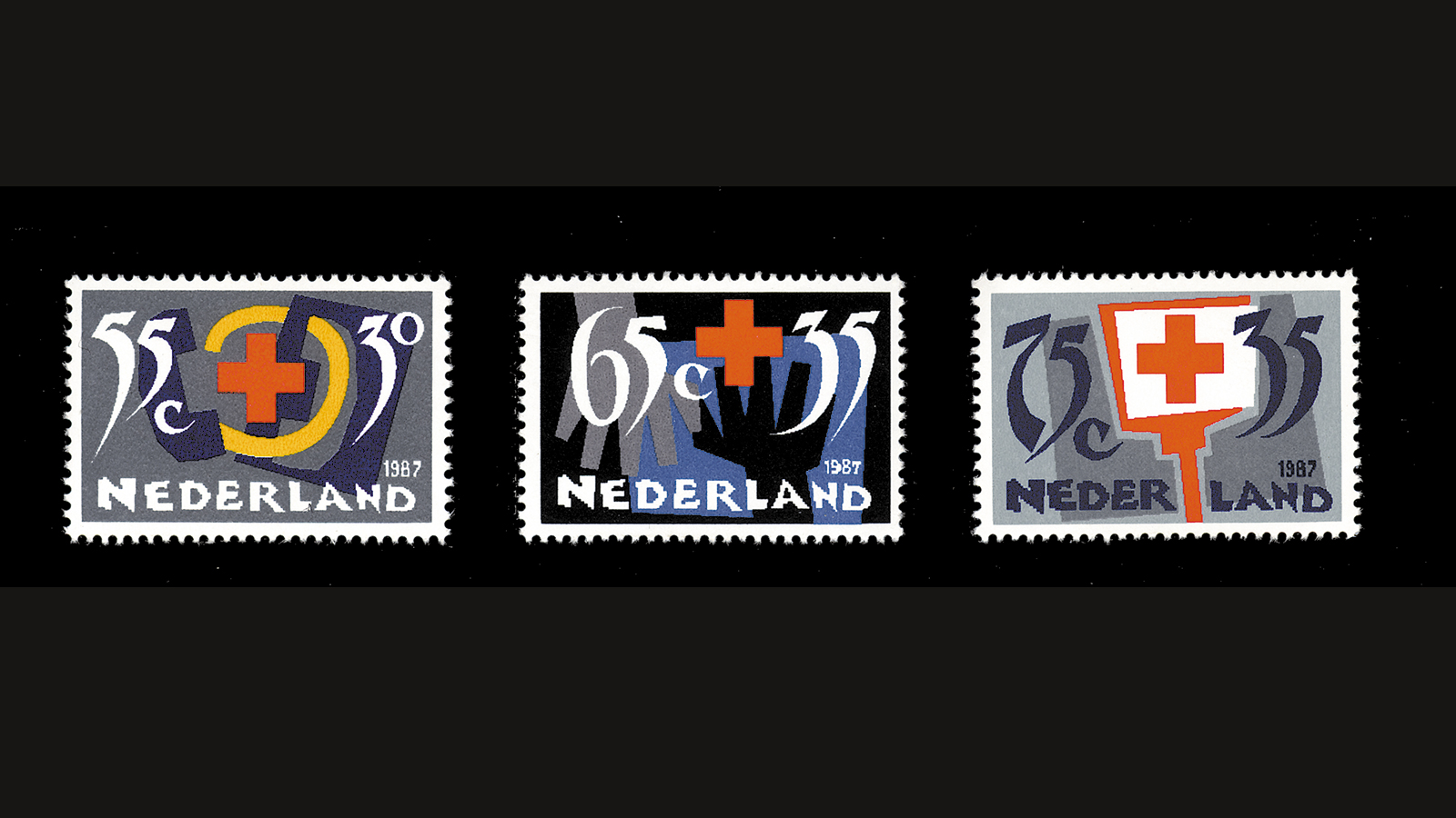
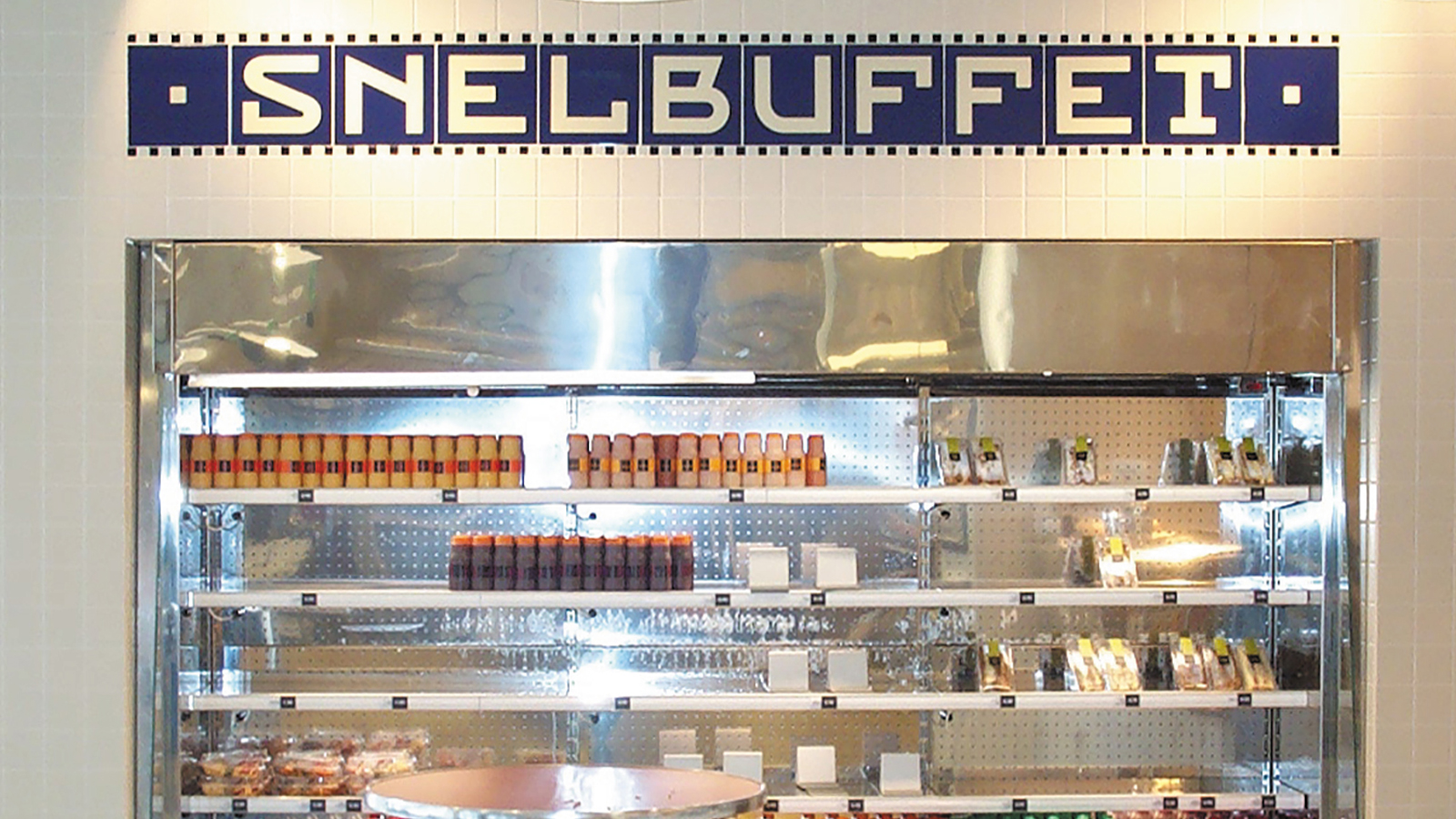
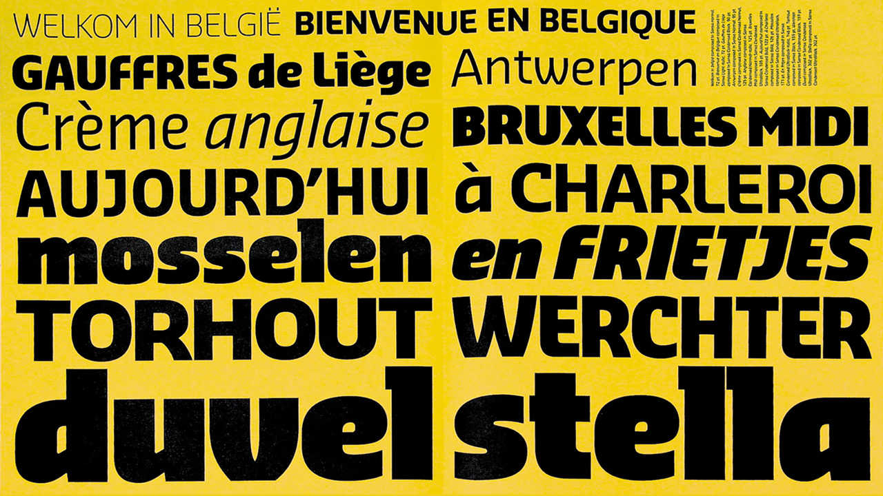
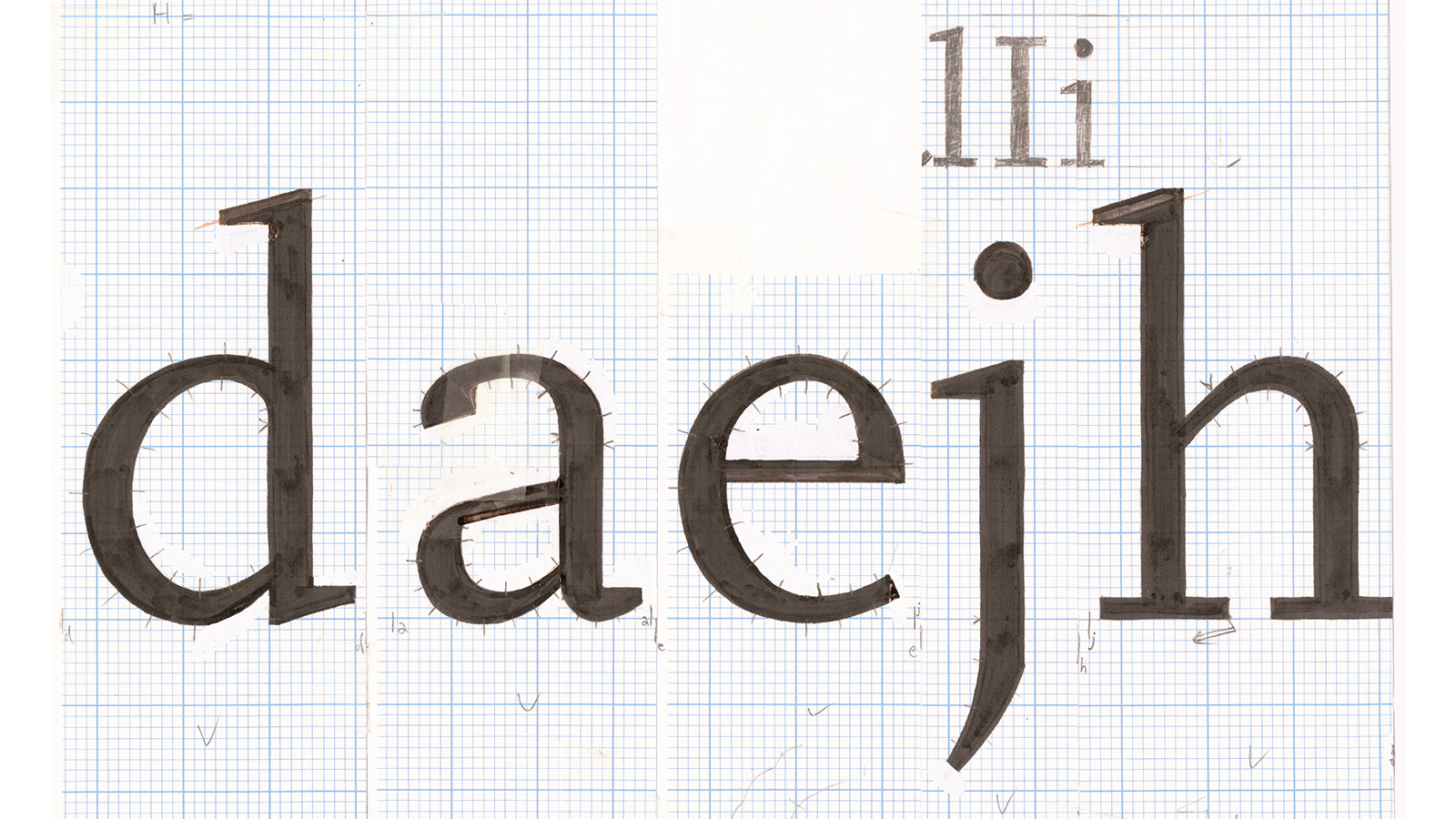
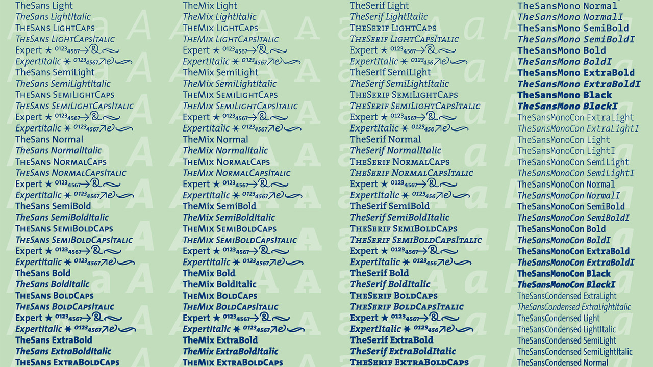
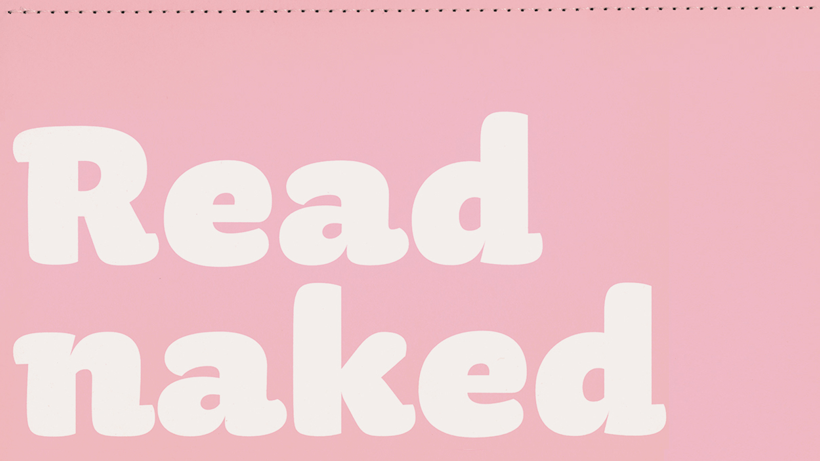
…would you like to be in that list? Mail us! A small selection of some of the best looking and most fascinating images from the book. Here’s a selection of double-page spreads on Issuu.
To our shop list!
Are you a bookshop?
Nederland, Vlaanderen
Deutschland
UK, North & Latin America, Asia, Australia
Are you a bookshop and…
Eye candy
Browse a trailer